by Inna Kniazieva, Holistic Lifestyle Coach
Colour plays a vital role in our lives, influencing our emotions, moods, and perceptions. Whether it’s choosing an outfit that reflects our personal style or designing the perfect interior space, understanding the science of colour can greatly enhance our ability to create harmonious and visually appealing combinations.
The Basics of Colour Theory
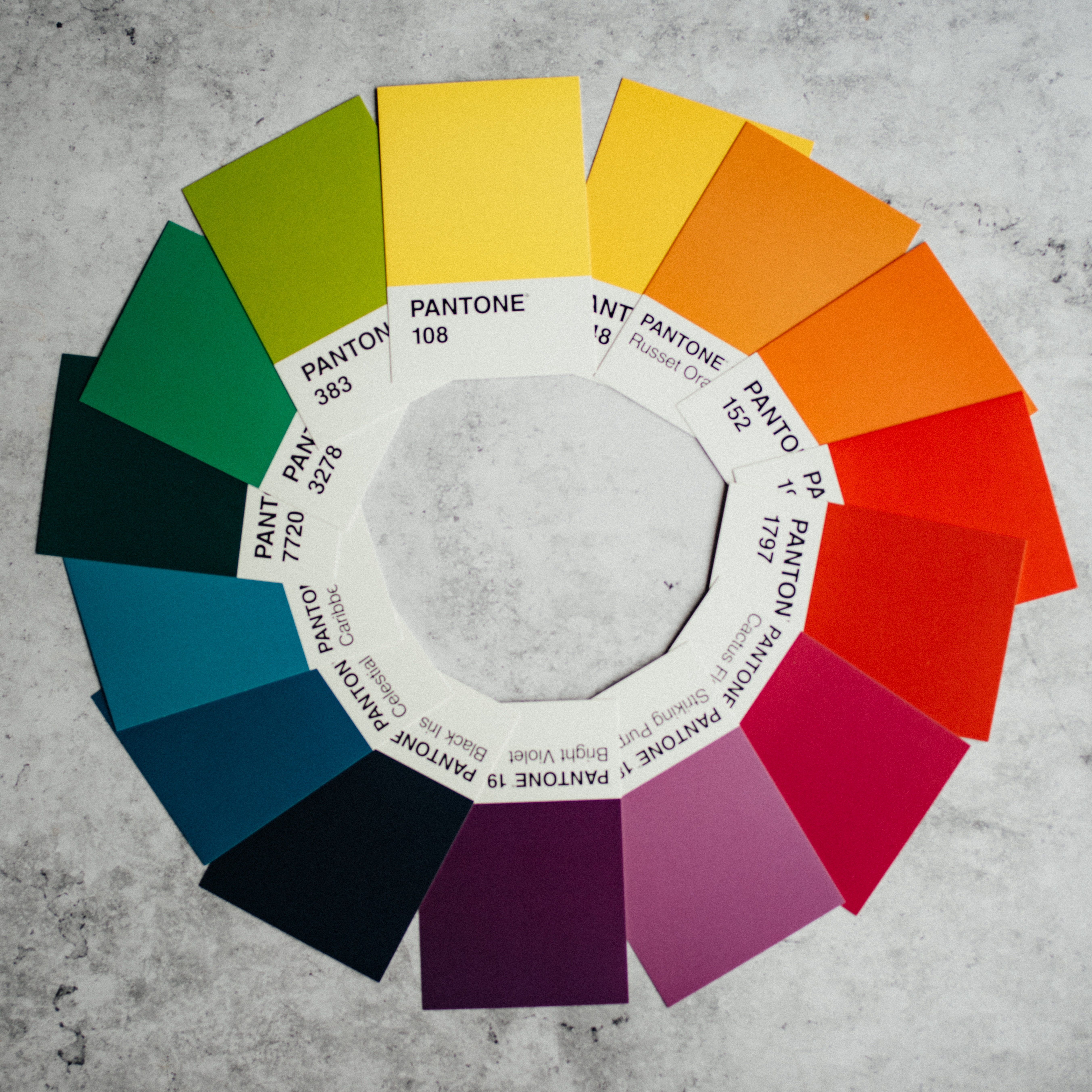
Before delving into the art of colour matching, it is essential to grasp the basics of colour theory. The colour wheel is a useful tool in understanding colour relationships. The primary colours—red, blue, and yellow—are located at equidistant points on the wheel. By combining these primary colours, we can create secondary colours—orange, green, and purple. Further mixing primary and secondary colours yields tertiary colours.
Complementary Colours
Complementary colours are those that appear opposite each other on the colour wheel. They create a vibrant contrast and tend to intensify each other. For personal style, incorporating complementary colours can make a bold statement. For instance, pairing a deep blue blouse with a mustard yellow skirt can create a striking and fashionable look.
In interior design, complementary colours can be used to create a focal point. A popular combination is blue and orange, where a navy-blue sofa can be complemented by orange throw pillows or accent pieces.
Analogous Colours
Analogous colours are adjacent to each other on the colour wheel and share a similar undertone. When selecting analogous colours for personal style, consider combining shades of the same colour family. For instance, pairing a light pink blouse with a dusty rose pants can create an elegant and sophisticated look.
In interior design, a living room with various shades of green, such as sage, mint, and forest green, can create a soothing and nature-inspired ambiance. Adding hints of a contrasting colour, such as a few yellow throw pillows, can add visual interest without disrupting the overall harmony.
Triadic Colours
Triadic colour schemes involve three colours that are equidistant from each other on the colour wheel, forming a triangle. This combination provides a balanced yet vibrant look.
In interior design, for example, a child’s playroom could incorporate a combination of red, blue, and yellow, creating a vibrant and stimulating environment.
Understanding Undertones
Another crucial aspect of colour matching is understanding undertones. Colours have warm or cool undertones, which can greatly impact their compatibility. Warm undertones, such as yellows, oranges, and reds, create a cozy and inviting atmosphere. Cool undertones, such as blues, greens, and purples, evoke a sense of calmness and serenity.
For example, if you have warm undertones in your skin, earthy colours like terracotta, mustard, and olive green may complement your complexion. In interior design, pairing cool undertones, like a blue-gray wall colour, with warm undertones, such as a wooden floor or furniture, can create a visually pleasing contrast.
Experimentation
While colour theory provides a foundation for understanding colour relationships, it’s important to remember that personal preference and experimentation play significant roles in colour matching. Sometimes, the most unexpected pairings can result in stunning and innovative designs.
In conclusion, mastering the science of colour and learning how to match colours for personal style and interior design can significantly enhance your creative endeavors.
Happy colour matching!

Click here to the Copperfield Community News home page for the latest Copperfield community updates.
Click here to the Mahogany Community News home page for the latest Mahogany community updates.


